

Clear Illustrations of Racial Divide (And Abstract Art?)
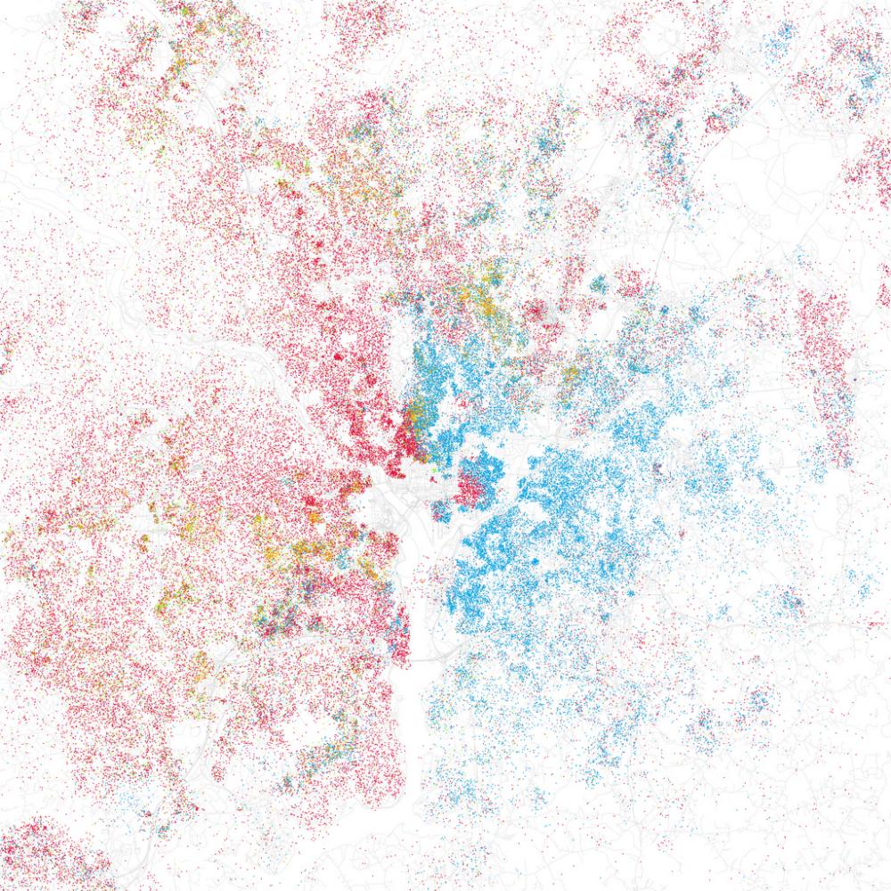
Recognize that image? Here’s a hint: red represents white, blue represents black, and that white gap down the lower middle is the Potomac River. Yes, it’s Washington, DC.
Racial divide in this country is, unarguably, still a reality. Given that, it’s still shocking to see it represented visually. Using information from the 2000 Census, Eric Fischer created maps of urban areas that show racial integration (or more often, segregation).
Yesterday Gawker posted a piece highlighting Fischer’s Flickr sets, which were inspired by artist Bill Rankin’s stylization of a map of Chicago. In Fischer’s words:
“I was astounded by Bill Rankin’s map of Chicago’s racial and ethnic divides and wanted to see what other cities looked like mapped the same way.”
Each mapped dot represents 25 people–each red dot is 25 white people, for instance. Blue dots represent black, green is Asian, and orange is Hispanic.
The visualization of DC makes the city’s east-west racial divide seem even starker. It’s not necessarily surprising, but it is astonishing to see this way.
Fischer is a veteran of such projects. Earlier this year, he used Flickr’s geotagging feature to create maps that illustrate how the locations where tourists take photos and the locations where locals take photos differ. (Blue pictures are by locals, red pictures are by tourists, yellow pictures may be by either.)
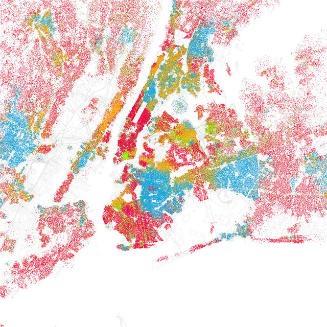
Below are three more interesting examples. First: New York City. Second: Detroit, Michigan. Third: my hometown, Dallas, Texas.
Photos: Flickr/ Eric Fischer


